Plot
Working with Checkbox and ListView can be the real pain. It was on 14 November 2016, when an issue in one of my GitHub repositories made it clear. Thanks to him I have a picture to show it.

The problem with the checkbox can be seen in the screenshot above. Sometimes performing clicks on checkboxes makes no difference. We can see the animation after clicking checkbox though it doesn’t get checked.
The problem became even worse when of the library user asked to make entire list item clickable. First clicking checkbox made a considerable change, then it was a list item.
The problem became worst when I implemented marking option in the library and all marked items were uncheckable for first few clicks. You can read entire conversation here.
It was on 19th of May when I decided to end it. I created a custom Checkbox to fix it.
Tutorial
Overview
In Android, all UI widgets we can think of are generalized as View. Views are the building blocks for application interface components. A Derived Class of View named ViewGroup is used as a basis for defining containers for views. Layout components like RelativeLayout/FrameLayout are examples for ViewGroups.
CustomViews can be created by:
- Inheriting View class directly.
- Inheriting a Derived View Class (eg. Button/TextView).
In this tutorial, we are going to make a custom Checkbox which can possibly replace stock Checkbox in most of the cases.
So Let’s get started!
Recipe
1. Setting up Project
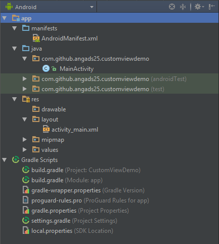
Fire Up Android Studio and create a new Android Application project from File ⇒ New ⇒ New Project. I selected Empty Activity as the default activity for getting a toolbar. Here is how project structure will be.
2. Creating Custom Checkbox Class
- Create a new Java class from File ⇒ New ⇒ Java Class in your default application package and name it as MaterialCheckbox.
- Make MaterialCheckbox class extend View class and create the class constructor and override methods as below:
	package com.github.angads25.customviewdemo;

	import android.content.Context;
	import android.graphics.Canvas;
	import android.support.annotation.Nullable;
	import android.util.AttributeSet;
	import android.view.View;

	/**
	 *
	 * Created by Angad on 21-05-2017.
	 *
	 */

	public class MaterialCheckbox extends View {
		private Context context;

		// This constructor will come handy for creating MaterialCheckbox dynamically
		// using java code.
		public MaterialCheckbox(Context context) {
			super(context);
			initView(context);
		}

		// This constructor is implicitly called when view will be inflated to its
		// xml layout file
		public MaterialCheckbox(Context context, @Nullable AttributeSet attrs) {
			// 'attrs' is a set of the xml attributes of the view. Eg. for a TextView, in
			// android:text="" , 'text' is the attribute of TextView.
			// We won't be using it as of now but we know how important they are.
			super(context, attrs);
			initView(context);
		}

		// We will use this method to initialize class data members.
		private void initView(Context context) {
			this.context = context;
		}

		// This method is called every time a view is rendered. This is exactly where we
		// will be designing our checkbox.
		@Override
		protected void onDraw(Canvas canvas) {
			super.onDraw(canvas);
		}

		// This method measures the view and its content to determine the width and
		// height of the view.
		@Override
		protected void onMeasure(int widthMeasureSpec, int heightMeasureSpec) {
			super.onMeasure(widthMeasureSpec, heightMeasureSpec);
		}
	}
3. Measuring our checkbox
Here we will define the measurements of our Checkbox. For which we will be using ‘onMeasure’ method of View class. As checkbox are square in shape, we will be using a common width/height attribute for the MaterialCheckbox. The changes will be as below:
	public class MaterialCheckbox extends View {
 		private Context context;

		// The common width/height value we will be using for entire view.
		private int minDim;

		// This constructor will come handy for creating MaterialCheckbox dynamically
		// using java code.
		public MaterialCheckbox(Context context) {
			...
			...
			... // Other class methods
			...
			...
		}

		// This method measures the view and its content to determine the width and
		// height of the view.
		@Override
		protected void onMeasure(int widthMeasureSpec, int heightMeasureSpec) {
			super.onMeasure(widthMeasureSpec, heightMeasureSpec);

			// Returns the width as measured by the parent ViewGroup.
			int width = getMeasuredWidth();

			// Returns the height as measured by the parent ViewGroup.
			int height = getMeasuredHeight();

			// We will be taking min value of width and height. By doing so we will get a
			// value that can fit both.
			minDim = Math.min(width, height);

			// It is used for storing width and height of the view. We are using minDim for both
			// width and height, the result of doing so will be a square checkbox.
			setMeasuredDimension(minDim, minDim);
		}
	}
4. Defining Checkbox Properties
In this section, we will define properties of our checkbox. We will be using a boolean variable ‘checked’ for keeping the record that whether the checkbox has been checked or not. Below is the final MaterialCheckbox class after adding the attributes:
	public class MaterialCheckbox extends View {
 		private Context context;

		// The common width/height value we will be using for entire view.
		private int minDim;

		// Variable used to store state of the checkbox.
		private boolean checked;

		// Paint class contains styling and color information. It would keep all
		// the style and color information that is needed to draw various geometries
		// In our custom view.
		private Paint paint;

		// This constructor will come handy for creating MaterialCheckbox dynamically
		// using java code.
		public MaterialCheckbox(Context context) {
			...
			...
			...
		}

		// We will use this method to initialize class data members.
		private void initView(Context context) {
			this.context = context;

			// Initialize checked value with false. By default the checkbox isn't checked
			checked = false;

			// Instantiating our paint object.
			paint = new Paint();
		}

		// This method is called every time a view is rendered. This is exactly where we
		// will be designing our checkbox.
		@Override
		protected void onDraw(Canvas canvas) {
		...
		...
			// width and height, the result of doing so will be a square checkbox.
			setMeasuredDimension(minDim, minDim);
		}

		// Getter method for checking whether checkbox is checked or not.
		public boolean isChecked() {
			return checked;
		}

		// Setter method for setting the value of checked variable.
		public void setChecked(boolean checked) {
			this.checked = checked;

			// Invalidate method implicitly calls on draw method and entire
			// view is redrawn. It is important to update checkbox whenever
			// state of the checkbox is changed.
			invalidate();
		}
	}
5. Designing Custom Checkbox Class
Next, we will draw the layout of our checkbox. We are going to make our checkbox look like as good as the stock checkbox. For the reference below is the design we seek to make for both checked and unchecked states.

- We will start by making the outermost round rectangle for the checkboxes. The gray one for unchecked and the pink (colorAccent) one for the checked states.
	public class MaterialCheckbox extends View {
 		// We will be using this rectangle reference for keeping bounds of the checkbox.
		private RectF bounds;

		...
		...
		...

		// We will use this method to initialize class data members.
		private void initView(Context context) {
			this.context = context;

			// Initialize checked value with false. By default the checkbox isn't checked
			checked = false;

			// Instantiating our paint object.
			paint = new Paint();

			// Instantiating the RectF object.
			bounds = new RectF();
		}

		...
		...
		...

		// This method is called every time a view is rendered. This is exactly where we
		// will be designing our checkbox.
		@Override
		protected void onDraw(Canvas canvas) {
			super.onDraw(canvas);
			if(isChecked()) {
				// Drawing layout for the case when check box is checked.
				// Reset paint and start from scratch.
				paint.reset();

				// Setting it true will helpful in drawing smooth diagonal lines.
				paint.setAntiAlias(true);

				// bounds is the boundaries of the pink round square we are going to draw.
				// Important: Always use width/height for sizing geometrical objects.
				// Using width/height will make widgets adaptive and responsive for
				// different screen sizes.

				// First Attribute: It is the starting point (leftmost) of x-axis. Here I am using
				// (min/10) so that view natural has padding of (1/10)th of the side of square
				// at the left.

				// Second Attribute: It is the starting point (topmost) of y-axis. Here I am using
				// (min/10) so that view natural has padding of (1/10)th of the side of square
				// at the top.

				// Third Attribute: It is the ending point (rightmost) of x-axis. Here I am using
				// (minDim - min/10) so that view natural has padding of (1/10)th of the side of square
				// at the right.

				// Fourth Attribute: It is the ending point (bottommost) of y-axis. Here I am using
				// (minDim - min/10) so that view natural has padding of (1/10)th of the side of square
				// at the bottom.
				bounds.set(minDim / 10, minDim / 10, minDim - (minDim/10), minDim - (minDim/10));

				// Here we are setting color of the outermost square of checkbox using paint reference
				// we created earlier. We will be using colorAccent color which is pink in my case.
				if (Build.VERSION.SDK_INT >= Build.VERSION_CODES.M) {

					// There has been a little change in method from Android M. It also requires theme
					// to which color belongs to
					paint.setColor(getResources().getColor(R.color.colorAccent, context.getTheme()));
				}
				else {

					// Setting color for pre Marshmallow devices. Remember we are also supporting legacy
					// versions.
					paint.setColor(getResources().getColor(R.color.colorAccent));
				}

				// Here we are finally drawing the pink round square of ours. Here first argument
				// is our square boundaries and second and third arguments are the corner radius
				// for x and y axis respectively. We are also passing paint reference to specify
				// style and color information of rectangle.
				// Remember: Always use width/height for geometries for making the view responsive
				// for different screen sizes and resolutions.
				canvas.drawRoundRect(bounds, minDim / 8, minDim / 8, paint);

			}
			else {
				// Drawing layout for the case when check box is not checked.
				// Reset paint and start from scratch.
				paint.reset();

				// Setting it true will helpful in drawing smooth diagonal lines.
				paint.setAntiAlias(true);

				// bounds is the boundaries of the gray round square we are going to draw.
				// Important: Always use width/height for sizing geometrical objects.
				// Using width/height will make widgets adaptive and responsive for
				// different screen sizes.

				// First Attribute: It is the starting point (leftmost) of x-axis. Here I am using
				// (min/10) so that view natural has padding of (1/10)th of the side of square
				// at the left.

				// Second Attribute: It is the starting point (topmost) of y-axis. Here I am using
				// (min/10) so that view natural has padding of (1/10)th of the side of square
				// at the top.

				// Third Attribute: It is the ending point (rightmost) of x-axis. Here I am using
				// (minDim - min/10) so that view natural has padding of (1/10)th of the side of square
				// at the right.

				// Fourth Attribute: It is the ending point (bottommost) of y-axis. Here I am using
				// (minDim - min/10) so that view natural has padding of (1/10)th of the side of square
				// at the bottom.
				bounds.set(minDim / 10, minDim / 10, minDim - (minDim/10), minDim - (minDim/10));

				// Here we are setting color of the outermost square of checkbox using paint reference
				// we created earlier.
				paint.setColor(Color.parseColor("#C1C1C1"));

				// Here we are finally drawing the gray round square of ours. Here first argument
				// is our square boundaries and second and third arguments are the corner radius
				// for x and y axis respectively. We are also passing paint reference to specify
				// style and color information of rectangle.
				// Remember: Always use width/height for geometries for making the view responsive
				// for different screen sizes and resolutions.
				canvas.drawRoundRect(bounds, minDim / 8, minDim / 8, paint);
		}
	}
Below is the result we might have got for checked and unchecked states:

Current Progress Below is how you can use the checkbox in my XML layouts:
<com.github.angads25.customviewdemo.MaterialCheckbox android:id="@+id/chechbox" android:layout_width="32dp" android:layout_height="32dp" android:layout_margin="8dp" />
- Now we will be completing the unchecked state of the checkbox. Don’t worry, it isn’t going to be that difficult. All we will be doing is, we are going to draw another white rectangle above the gray one. Let’s see how to do this:
	public class MaterialCheckbox extends View {
		...
		...
		...
		...

 		// This method is called every time a view is rendered. This is exactly where we
		// will be designing our checkbox.
		@Override
		protected void onDraw(Canvas canvas) {
			super.onDraw(canvas);
			if(isChecked()) {
				...
				...
				...
			}
			else {
				...
				...
				...
				// Remember: Always use width/height for geometries for making the view responsive
				// for different screen sizes and resolutions.
				canvas.drawRoundRect(bounds, minDim / 8, minDim / 8, paint);

				// bounds is the boundaries of the white square we are going to draw.
				// Important: Always use width/height for sizing geometrical objects.
				// Using width/height will make widgets adaptive and responsive for
				// different screen sizes.

				// First Attribute: It is the starting point (leftmost) of x-axis. Here I am using
				// (min/5) so that view natural has padding of (1/5)th of the side of square
				// at the left.

				// Second Attribute: It is the starting point (topmost) of y-axis. Here I am using
				// (min/5) so that view natural has padding of (1/5)th of the side of square
				// at the top.

				// Third Attribute: It is the ending point (rightmost) of x-axis. Here I am using
				// (minDim - min/5) so that view natural has padding of (1/5)th of the side of square
				// at the right.

				// Fourth Attribute: It is the ending point (bottommost) of y-axis. Here I am using
				// (minDim - min/5) so that view natural has padding of (1/5)th of the side of square
				// at the bottom.
				bounds.set(minDim / 5, minDim / 5, minDim - (minDim/5), minDim - (minDim/5));

				// Changing color of square in paint. The color is changed to white.
				paint.setColor(Color.parseColor("#FFFFFF"));

				// Here we are finally drawing the gray round square of ours. Here first argument
				// is our square boundaries. We are also passing paint reference to specify
				// style and color information of rectangle.
				// Remember: Always use width/height for geometries for making the view responsive
				// for different screen sizes and resolutions.
				canvas.drawRect(bounds, paint);
			}
		}
	}
Below is the result we might have got for the unchecked state:

Unchecked Checkbox - Now, we will be making the design of checked state. For doing so, we will be using Path class. We will be using two lines in our path. First is the leftmost small line in the tick and Second is the one in the right. Let’s see how it is implemented:
public class MaterialCheckbox extends View { ... ... // We will be using this path reference for drawing tick on the checkbox. private Path tick; // We will use this method to initialize class data members. private void initView(Context context) { this.context = context; ... ... // Instantiating the Path object. tick = new Path(); } // This method is called every time a view is rendered. This is exactly where we // will be designing our checkbox. @Override protected void onDraw(Canvas canvas) { super.onDraw(canvas); if(isChecked()) { ... ... ... canvas.drawRoundRect(bounds, minDim / 8, minDim / 8, paint); // Here we are setting color of the tick inside checkbox using paint reference // we created earlier. paint.setColor(Color.parseColor("#FFFFFF")); // We are setting stroke width of the tick here. Larger it is, wider // would be the width of lines paint.setStrokeWidth(minDim/10); // Specifying the style that the stroke is to be drawn in the path. paint.setStyle(Paint.Style.STROKE); // Here we are finally drawing the path. canvas.drawPath(tick, paint); } ... ... } // This method measures the view and its content to determine the width and // height of the view. @Override protected void onMeasure(int widthMeasureSpec, int heightMeasureSpec) { super.onMeasure(widthMeasureSpec, heightMeasureSpec); ... ... ... setMeasuredDimension(minDim, minDim); } } - For drawing the required tick, we will be taking four points and will be drawing lines between them. For better understanding, I am referencing these points as A, B, C and D. We will be drawing a line between A ⇒ B and C ⇒ D.

Path points public class MaterialCheckbox extends View { ... ... @Override protected void onMeasure(int widthMeasureSpec, int heightMeasureSpec) { super.onMeasure(widthMeasureSpec, heightMeasureSpec); ... ... setMeasuredDimension(minDim, minDim); // Consider we are drawing the lines using an imaginary pen we are holding. // Point A // This is the point where we are putting the pen. tick.moveTo(minDim / 4, minDim / 2); // Point B // Till this point we are drawing a line tick.lineTo(minDim / 2.5f, minDim - (minDim / 3)); // Point C // Again, We are putting the pen to this point. tick.moveTo(minDim / 2.8f, minDim - (minDim / 3.25f)); // Point D //And drawing a line till this point. tick.lineTo(minDim - (minDim / 4), minDim / 3); } } - Finally, it’s time to make checkbox listen to touch gestures and change states accordingly. We will start by creating an Interface OnCheckedChangeListener and add a method as below:
	public interface OnCheckedChangeListener {
		void onCheckedChanged(MaterialCheckbox checkbox, boolean isChecked);
	}
Next, we will add a reference to interface in our MaterialCheckbox class and create a setter method for it.
	public class MaterialCheckbox extends View {
 		private Context context;

 		// Interface to handle checkbox state changes.
 		private OnCheckedChangeListener onCheckedChangeListener;
		...
		...
		...

		public void setOnCheckedChangeListener(OnCheckedChangeListener onCheckedChangeListener) {
			this.onCheckedChangeListener = onCheckedChangeListener;
		}
	}
Last, we will make checkbox change it’s state on click actions, for doing that we will be using OnClickListener interface of the View class. Below is the code for doing that, we are going to add some lines in the initView method.
	public class MaterialCheckbox extends View {
		...
		...

		private void initView(Context context) {
			...
			...
			// Handle click actions on checkbox.
			OnClickListener onClickListener = new OnClickListener() {
  			@Override
  		public void onClick(View v) {
  			// Change checked the state of the checkbox.
  			setChecked(!checked);
  			if(onCheckedChangeListener != null) {
  				// Let listener know that there has been a change in state if Checkbox.
						onCheckedChangeListener.onCheckedChanged(MaterialCheckbox.this, isChecked());
					}
				}
			};

			setOnClickListener(onClickListener);
		}
	}

	...
	...
}
For demonstration, I made a random list layout and below is how it looks like, with our own checkbox.You check for the changed state of checkbox exactly like you do with touch. Below is the snippet I used in my layout:
	MaterialCheckbox checkbox = (MaterialCheckbox) findViewById(R.id.chechbox);
	checkbox.setOnCheckedChangeListener(new OnCheckedChangeListener() {
		@Override
		public void onCheckedChanged(MaterialCheckbox checkbox, boolean isChecked) {
			// isChecked is the current state of the Checkbox.
		}
	});
 Angad Singh