There is no way a user can turn off a specific type of Notifications unless a way is explicitly provided in the app. The only way around is to turn off all the app Notifications. With Android O, Developers can create different channels for different types of notifications. Users can modify following characteristics from settings:
Importance
Notification Sound (Tones)
Blink Light
Vibration
Lock Screen
Do Not Disturb
Channel Settings
Creating Notification Channel
A Notification Channel can be created by instantiating a NotificationChannel reference. A Notification channel takes channel id, channel name, and importance.
The channel id is different and has to be unique for each channel.
Here ‘sports’ is the channel id and ‘Sports’ is the channel name.
Creating Notification
We can add notification to a channel by making a slight change in our old way of creating a notification.
Notification.Builder builder1 = new Notification.Builder(getApplicationContext(), "sports")
        .setContentTitle("Sports")
        .setContentText("India V/s New Zealand match postponed due to rain")
        .setSmallIcon(R.drawable.ic_launcher_background)
        .setChannelId("sports") //Specifying channel id of notification
        .setAutoCancel(true);
Just by setting the channel id in the notification, It will be shown in its corresponding channel.
Notifications from different channels
You can download the sample code for this blog from here.
Android provides a set of libraries to help to design of a highly maintainable and robust code. They have provided with helper classes for better data caching and handling UI component states.
Room
The Room is a robust SQL object mapping library. It provides a layer of Abstraction over the Android’s SQLite Database. Allowing us to fluently access the power of SQLite database.
There are 3 major components in Room:
Database: Contains the database holder and serves as the main access point for the app’s persisted relational data.
Entity: Represents a table within the database.
DAO:
Contains the methods used for accessing the database.
Architecture Diagram
Boiler Plate Code
In this tutorial we will be making a very basic Todo Application, that will perform CRUD operations using the Room Database.
Todo AppBoilerplate Project Structure
The boilerplate code can create, update and delete a todo/memo. However, the data won’t persist as soon as the app is closed.
Our main screen is a having a recyclerview to list all of our todos. The model of the todo is saved in the model package which is as below:
public class Todo {
  private long _id;

  private String todoTitle;

  private String todoText;

  private long timeStamp;

  public long get_id() {
      return _id;
  }

  public void set_id(long _id) {
      this._id = _id;
  }

  public String getTodoTitle() {
      return todoTitle;
  }

  public void setTodoTitle(String todoTitle) {
      this.todoTitle = todoTitle;
  }

  public String getTodoText() {
      return todoText;
  }

  public void setTodoText(String todoText) {
      this.todoText = todoText;
  }

  public long getTimeStamp() {
      return timeStamp;
  }

  public void setTimeStamp(long timeStamp) {
      this.timeStamp = timeStamp;
  }
}
We will be using this class as an Entity (Table) for our database. Through annotations, Room makes it much easier to define the properties of the table. Annotations like PrimaryKey, ColumnInfo are quite understandable by name.
A table is created using @Entity annotation and the ‘tableName’ attributes are used to provide a table name. We define primary key of the table using @PrimaryKey annotation and columns of the table using @ColumnInfo annotation and their respective names with a name attribute.
Our model class after adding annotations will look as below:
@Entity(tableName = "todo")
public class Todo {
  @PrimaryKey
  private long _id;

  @ColumnInfo(name = "title")
  private String todoTitle;

  @ColumnInfo(name = "text")
  private String todoText;

  @ColumnInfo(name = "time")
  private long timeStamp;

  public long get_id() {
      return _id;
  }

  public void set_id(long _id) {
      this._id = _id;
  }

  public String getTodoTitle() {
      return todoTitle;
  }

  public void setTodoTitle(String todoTitle) {
      this.todoTitle = todoTitle;
  }

  public String getTodoText() {
      return todoText;
  }

  public void setTodoText(String todoText) {
      this.todoText = todoText;
  }

  public long getTimeStamp() {
      return timeStamp;
  }

  public void setTimeStamp(long timeStamp) {
      this.timeStamp = timeStamp;
  }
}
Next, We will be making our interface for performing CRUD operations.
The dao interface has to be annotated with @Dao annotation. We use @Query annotation for executing a query and @Insert, @Update and @Delete for insertion, deletion, and updating respectively.
The dao interface will finally look as below:
@Dao
public interface AppDao {
    @Query("Select * from " + AppConstants.DB_NAME + " order by time desc")
    List<Todo> getAllTodos();

    @Query("Select * from " + AppConstants.DB_NAME + " where _id = :id order by time desc")
    Todo getTodo(String id);
@Insert
    void insertTodo(Todo todo);

    @Update
    void updateTodo(Todo todo);

    @Delete
    void deleteTodo(Todo todo);
}
Attribute values can also be passed via interface method arguments and are used in queries with ‘:’ sign. As we can see in case of ‘getTodo’.
And at last, we will create an abstract Database Class that will extend RoomDatabase class.
Database class is created through @Database annotation, it is mandatory to specify entities and version of the database. In our Database class, we will add access methods of our each Dao class.
The AppDatabase class is as below:
@Database(entities = {Todo.class}, version = 1) extends RoomDatabase {
    public abstract AppDao appDao();
}
We will also be using a Singleton class to get the reference to our AppDao interface. Which is as below:
public class AppDBHandler {
    private AppDao appdao;
    private static AppDBHandler ourInstance;

    public static AppDBHandler getInstance(Context context) {
        if(ourInstance == null) {
            ourInstance = new AppDBHandler(context);
        }
        return ourInstance;
    }

    private AppDBHandler(Context context) {
        AppDatabase db = Room.databaseBuilder(context, AppDatabase.class, AppConstants.DB_NAME).build();
        appdao = db.appDao();
    }

    public AppDao getAppDao() {
        return appdao;
    }
}
At last, we are all done with setting up database boilerplate for the project. Now the only thing left to do is adding database operations in our project using our Dao interface.
The Room directly maps the database model to our Java Bean.
In our MainActivity.class, we will add following lines to retrieve the list of all todos. Just below setting adapter to our recyclerview.
MainActivity.java
...
...
recyclerView.setAdapter(todoListAdapter);
final AppDao dao = AppDBHandler.getInstance(getApplicationContext()).getAppDao();
Thread T1 = new Thread(new Runnable() {
    @Override
    public void run() {
        todos.addAll(dao.getAllTodos());
        runOnUiThread(new Runnable() {
            @Override
            public void run() {
                todoListAdapter.notifyItemRangeInserted(0, todos.size());
            }
        });
    }
});
T1.start();
Note: All the database calls in Room are synchronous and run on same thread to which they are called. If the call is a made on UI thread, then it will throw a IllegalStateException.
MainActivity.java
...
...
case 1: {
    final AppDao dao = AppDBHandler.getInstance(getApplicationContext()).getAppDao();
    Thread T1 = new Thread(new Runnable() {
        @Override
        public void run() {
            dao.deleteTodo(todos.get(position));
            todos.remove(position);
            runOnUiThread(new Runnable() {
                @Override
                public void run() {
                    Snackbar.make(parentLayout, "Todo Deleted", Snackbar.LENGTH_SHORT).show();
                    todoListAdapter.notifyItemRemoved(position);
                }
            });
        }
    });
    T1.start();
    break;
}
We are using a single Dialog for creating and editing new todos. In our logic, we are using a private Todo class reference null value of which signifies whether the action is an update or a create action. We will modify our existing logic as below:
CreateTodoDialog.java
    ...
    ...
    @Override
    public void onClick(View view) {
        ...
        ...
        if(this.todo == null) {
            todo = new Todo();
            todo.set_id(System.currentTimeMillis());
            todo.setTimeStamp(System.currentTimeMillis());
            todo.setTodoTitle(edtTitle.getText().toString());
            todo.setTodoText(edtText.getText().toString());
            final AppDao dao = AppDBHandler.getInstance(getContext()).getAppDao();
            Thread T1 = new Thread(new Runnable() {
                @Override
                public void run() {
                    dao.insertTodo(todo);
                    dataCallbackListener.onDataReceived(todo);
                }
            });
            T1.start();
        } else {
            todo.setTimeStamp(System.currentTimeMillis());
            todo.setTodoTitle(edtTitle.getText().toString());
            todo.setTodoText(edtText.getText().toString());
            final AppDao dao = AppDBHandler.getInstance(getContext()).getAppDao();
            Thread T1 = new Thread(new Runnable() {
                @Override
                public void run() {
                    dao.updateTodo(todo);
                    dataCallbackListener.onDataReceived(todo);
                }
            });
            T1.start();
        }
And that’s it, the Room itself will use the provided pojo for performing insert and update operations.
Remarks
I believe that it will be very helpful in creating applications that require data caching and have well structure models for reusability. Especially, e-commerce applications in which we can model our product details like and can easily use them in carts and product info sections (Eg. quantity, favorites) where we can prevent unnecessary API calls.
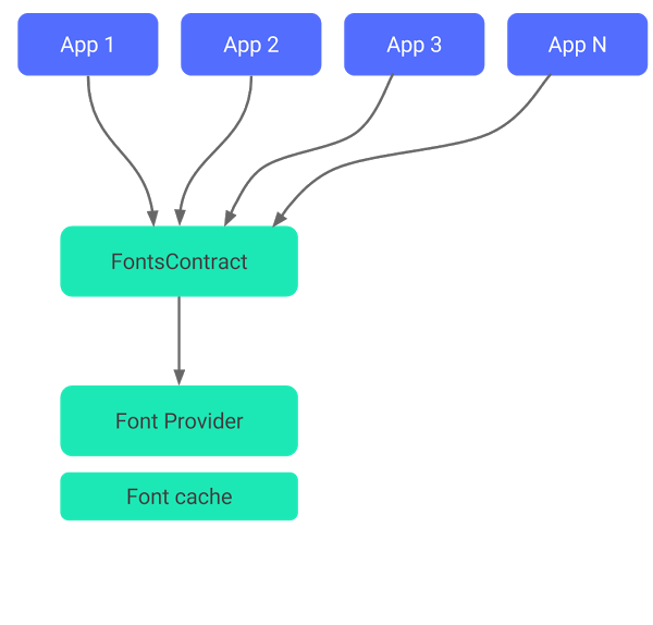
One of the most exciting announcements by Google in I/O 17 was providing support for custom fonts. Not as an asset but fonts can now be used as a resource. An application can also use one of many Google Fonts dynamically. As fonts are now supported natively, the same font can be used by different applications.
The feature is extended to support API version 14 and above through Support Library 26. Below is a brief overview of how fonts are used by applications:
Fig. 1.0 Downloadable Fonts process
FontContract is a Utility class that deals with Font Content Provider. Downloaded Fonts are cache within the device. Since multiple devices share a single endpoint for fonts. Hence, fonts are shared across different applications.
Advantages of using Downloadable fonts:
Reduced APK size. As fonts are no longer needed to be kept in APK.
Fonts are shared by different applications through a single provider. Hence it saves phone memory and user data. Fonts are downloaded only when they are needed.
Where Downloadable fonts might not work:
Fonts may fail to load/download depending upon network connection, in which case default font are used.
Downloadable fonts require a Font Provider, for eg. Google Fonts are provided by Google Play Services.
With Support Library and Android O, Fonts can be used with these two features:
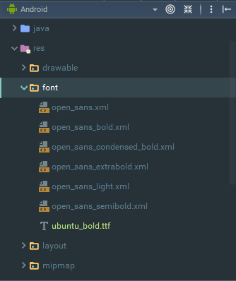
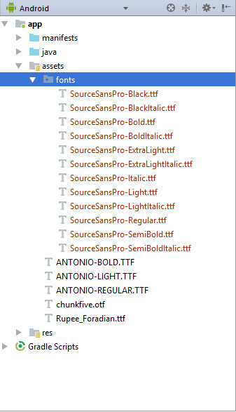
Creating a new project in Android Studio 3.0, we can see a ‘font’ directory in our ‘res’ folder. We can add our custom fonts(ttf and otf) in this directory and can use them in the project like we use other resources. More than that, you can also create font family where you can define different fonts with styles and weights.
Fig. 1.1 Font Resource Directory
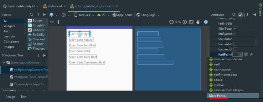
The Ubuntu font can be directly used in a View like AppCompatButton, AppCompatTextView using ‘fontFamily’ tag as below:
The fonts are no longer supposed to be a bundled with the apk, but instead, they are downloaded on demand from Font Provider when are needed by an Application. If other apps in the system use the same font the fonts are reused. In case fonts fail to download, then default system fonts are used.
Let’s see how simple it is to implement a font provider using XML.
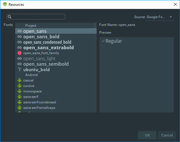
In layout editor attributes, we can find a fontFamily property of the view (AppCompatTextView in our case). Clicking on the drop-down, we will see More Fonts.. option in the bottom.
Fig. 1.2 Font Family view property
We will this dialog after selecting More Fonts option from where we can pick any of the google fonts from there and the studio will set up everything for us!
Fonts can be downloaded dynamically using Java/Kotlin code. We start by creating a FontRequest. A FontRequest requires a provider authority, provider package, font query and certificate array. Parameters are same as of the XML parameters.
class Activity:AppCompatActivity() {
....
    private var regular: AppCompatTextView? = null
    private val certificate = R.array.com_google_android_gms_fonts_certs

    override fun onCreate(savedInstanceState: Bundle?) {
        super.onCreate(savedInstanceState)
        setContentView(R.layout.activity_labels_no_fonts)
        regular = findViewById(R.id.tv_regular)
        ...
        ...
        val sansRegularRequest = FontRequest(Companion.PROVIDER_AUTHORITY, PROVIDER_PACKAGE, "Open Sans", certificate)
        val sansRegularCallback = object : FontsContractCompat.FontRequestCallback() {
            override fun onTypefaceRetrieved(typeface: Typeface?) {
                // Called When fonts are loaded/downloaded
                regular!!.typeface = typeface
            }
            override fun onTypefaceRequestFailed(reason: Int) {
                // Called When fonts fail to loaded/downloaded, Here reason is the error code
                // Read more about reasons from here:
                // https://developer.android.com/reference/android/provider/FontsContract.FontRequestCallback.html#FAIL_REASON_FONT_LOAD_ERROR
            }
        }
        FontsContractCompat.requestFont(this, sansRegularRequest, sansRegularCallback, Handler())
    }

    companion object {
        private val PROVIDER_PACKAGE = "com.google.android.gms"
        private val PROVIDER_AUTHORITY = PROVIDER_PACKAGE + ".fonts"
    }
}
As a callback to FontRequest, we use FontsContract.FontRequestCallback object, that provides us with two callback methods to handle FontRequest responses.
onTypefaceRetrieved method is called when the font is downloaded. It provides with a TypeFace object of the requested font.
onTypefaceRequestFailed method is called when the queried font fails to load, the method argument provides with an int error code for reason of failure. You can read about various error codes here.
FontsContractCompat.requestFont method is used to make request of font.
Note: The last argument of FontsContractCompat.requestFont takes a handler thread as an input, just make sure that it isn’t a UI thread.
And here is the final app after implementing all weighted fonts.
Fig 1.4 Final App Screenshot
Remarks
I personally think this will actually make it easier to develop highly customized apps in a better way. Gone are the days when all fonts were a part of app assets.
Fig. 1.5 Some Old Memories
We cannot ignore the fact that fonts are executable, hence they come with their own security risks.
Working with Checkbox and ListView can be the real pain. It was on 14 November 2016, when an issue in one of my GitHub repositories made it clear. Thanks to him I have a picture to show it.
FilePicker Dialog
The problem with the checkbox can be seen in the screenshot above. Sometimes performing clicks on checkboxes makes no difference. We can see the animation after clicking checkbox though it doesn’t get checked.
The problem became even worse when of the library user asked to make entire list item clickable. First clicking checkbox made a considerable change, then it was a list item.
The problem became worst when I implemented marking option in the library and all marked items were uncheckable for first few clicks. You can read entire conversation here.
It was on 19th of May when I decided to end it. I created a custom Checkbox to fix it.
Tutorial
Overview
In Android, all UI widgets we can think of are generalized as View. Views are the building blocks for application interface components. A Derived Class of View named ViewGroup is used as a basis for defining containers for views. Layout components like RelativeLayout/FrameLayout are examples for ViewGroups.
CustomViews can be created by:
Inheriting View class directly.
Inheriting a Derived View Class (eg. Button/TextView).
In this tutorial, we are going to make a custom Checkbox which can possibly replace stock Checkbox in most of the cases.
So Let’s get started!
Recipe
1. Setting up Project
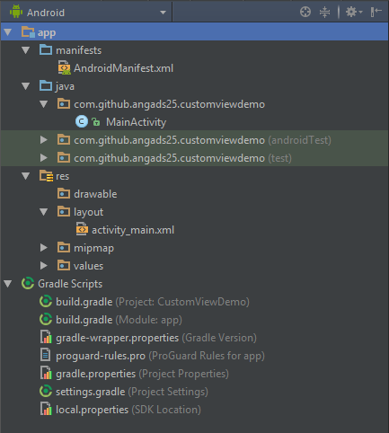
Fire Up Android Studio and create a new Android Application project from File ⇒ New ⇒ New Project. I selected Empty Activity as the default activity for getting a toolbar. Here is how project structure will be.
Project Structure
2. Creating Custom Checkbox Class
Create a new Java class from File ⇒ New ⇒ Java Class in your default application package and name it as MaterialCheckbox.
Make MaterialCheckbox class extend View class and create the class constructor and override methods as below:
	package com.github.angads25.customviewdemo;

	import android.content.Context;
	import android.graphics.Canvas;
	import android.support.annotation.Nullable;
	import android.util.AttributeSet;
	import android.view.View;

	/**
	 *
	 * Created by Angad on 21-05-2017.
	 *
	 */

	public class MaterialCheckbox extends View {
		private Context context;

		// This constructor will come handy for creating MaterialCheckbox dynamically
		// using java code.
		public MaterialCheckbox(Context context) {
			super(context);
			initView(context);
		}

		// This constructor is implicitly called when view will be inflated to its
		// xml layout file
		public MaterialCheckbox(Context context, @Nullable AttributeSet attrs) {
			// 'attrs' is a set of the xml attributes of the view. Eg. for a TextView, in
			// android:text="" , 'text' is the attribute of TextView.
			// We won't be using it as of now but we know how important they are.
			super(context, attrs);
			initView(context);
		}

		// We will use this method to initialize class data members.
		private void initView(Context context) {
			this.context = context;
		}

		// This method is called every time a view is rendered. This is exactly where we
		// will be designing our checkbox.
		@Override
		protected void onDraw(Canvas canvas) {
			super.onDraw(canvas);
		}

		// This method measures the view and its content to determine the width and
		// height of the view.
		@Override
		protected void onMeasure(int widthMeasureSpec, int heightMeasureSpec) {
			super.onMeasure(widthMeasureSpec, heightMeasureSpec);
		}
	}
3. Measuring our checkbox
Here we will define the measurements of our Checkbox. For which we will be using ‘onMeasure’ method of View class. As checkbox are square in shape, we will be using a common width/height attribute for the MaterialCheckbox. The changes will be as below:
	public class MaterialCheckbox extends View {
 		private Context context;

		// The common width/height value we will be using for entire view.
		private int minDim;

		// This constructor will come handy for creating MaterialCheckbox dynamically
		// using java code.
		public MaterialCheckbox(Context context) {
			...
			...
			... // Other class methods
			...
			...
		}

		// This method measures the view and its content to determine the width and
		// height of the view.
		@Override
		protected void onMeasure(int widthMeasureSpec, int heightMeasureSpec) {
			super.onMeasure(widthMeasureSpec, heightMeasureSpec);

			// Returns the width as measured by the parent ViewGroup.
			int width = getMeasuredWidth();

			// Returns the height as measured by the parent ViewGroup.
			int height = getMeasuredHeight();

			// We will be taking min value of width and height. By doing so we will get a
			// value that can fit both.
			minDim = Math.min(width, height);

			// It is used for storing width and height of the view. We are using minDim for both
			// width and height, the result of doing so will be a square checkbox.
			setMeasuredDimension(minDim, minDim);
		}
	}
4. Defining Checkbox Properties
In this section, we will define properties of our checkbox. We will be using a boolean variable ‘checked’ for keeping the record that whether the checkbox has been checked or not. Below is the final MaterialCheckbox class after adding the attributes:
	public class MaterialCheckbox extends View {
 		private Context context;

		// The common width/height value we will be using for entire view.
		private int minDim;

		// Variable used to store state of the checkbox.
		private boolean checked;

		// Paint class contains styling and color information. It would keep all
		// the style and color information that is needed to draw various geometries
		// In our custom view.
		private Paint paint;

		// This constructor will come handy for creating MaterialCheckbox dynamically
		// using java code.
		public MaterialCheckbox(Context context) {
			...
			...
			...
		}

		// We will use this method to initialize class data members.
		private void initView(Context context) {
			this.context = context;

			// Initialize checked value with false. By default the checkbox isn't checked
			checked = false;

			// Instantiating our paint object.
			paint = new Paint();
		}

		// This method is called every time a view is rendered. This is exactly where we
		// will be designing our checkbox.
		@Override
		protected void onDraw(Canvas canvas) {
		...
		...
			// width and height, the result of doing so will be a square checkbox.
			setMeasuredDimension(minDim, minDim);
		}

		// Getter method for checking whether checkbox is checked or not.
		public boolean isChecked() {
			return checked;
		}

		// Setter method for setting the value of checked variable.
		public void setChecked(boolean checked) {
			this.checked = checked;

			// Invalidate method implicitly calls on draw method and entire
			// view is redrawn. It is important to update checkbox whenever
			// state of the checkbox is changed.
			invalidate();
		}
	}
5. Designing Custom Checkbox Class
Next, we will draw the layout of our checkbox. We are going to make our checkbox look like as good as the stock checkbox. For the reference below is the design we seek to make for both checked and unchecked states.
Checkbox Design
We will start by making the outermost round rectangle for the checkboxes. The gray one for unchecked and the pink (colorAccent) one for the checked states.
public class MaterialCheckbox extends View {
// We will be using this rectangle reference for keeping bounds of the checkbox.
private RectF bounds;
...
...
...
// We will use this method to initialize class data members.
private void initView(Context context) {
this.context = context;
// Initialize checked value with false. By default the checkbox isn't checked
checked = false;
// Instantiating our paint object.
paint = new Paint();
// Instantiating the RectF object.
bounds = new RectF();
}
...
...
...
// This method is called every time a view is rendered. This is exactly where we
// will be designing our checkbox.
@Override
protected void onDraw(Canvas canvas) {
super.onDraw(canvas);
if(isChecked()) {
// Drawing layout for the case when check box is checked.
// Reset paint and start from scratch.
paint.reset();
// Setting it true will helpful in drawing smooth diagonal lines.
paint.setAntiAlias(true);
// bounds is the boundaries of the pink round square we are going to draw.
// Important: Always use width/height for sizing geometrical objects.
// Using width/height will make widgets adaptive and responsive for
// different screen sizes.
// First Attribute: It is the starting point (leftmost) of x-axis. Here I am using
// (min/10) so that view natural has padding of (1/10)th of the side of square
// at the left.
// Second Attribute: It is the starting point (topmost) of y-axis. Here I am using
// (min/10) so that view natural has padding of (1/10)th of the side of square
// at the top.
// Third Attribute: It is the ending point (rightmost) of x-axis. Here I am using
// (minDim - min/10) so that view natural has padding of (1/10)th of the side of square
// at the right.
// Fourth Attribute: It is the ending point (bottommost) of y-axis. Here I am using
// (minDim - min/10) so that view natural has padding of (1/10)th of the side of square
// at the bottom.
bounds.set(minDim / 10, minDim / 10, minDim - (minDim/10), minDim - (minDim/10));
// Here we are setting color of the outermost square of checkbox using paint reference
// we created earlier. We will be using colorAccent color which is pink in my case.
if (Build.VERSION.SDK_INT &amp;amp;amp;amp;amp;amp;amp;amp;amp;amp;amp;gt;= Build.VERSION_CODES.M) {
// There has been a little change in method from Android M. It also requires theme
// to which color belongs to
paint.setColor(getResources().getColor(R.color.colorAccent, context.getTheme()));
}
else {
// Setting color for pre Marshmallow devices. Remember we are also supporting legacy
// versions.
paint.setColor(getResources().getColor(R.color.colorAccent));
}
// Here we are finally drawing the pink round square of ours. Here first argument
// is our square boundaries and second and third arguments are the corner radius
// for x and y axis respectively. We are also passing paint reference to specify
// style and color information of rectangle.
// Remember: Always use width/height for geometries for making the view responsive
// for different screen sizes and resolutions.
canvas.drawRoundRect(bounds, minDim / 8, minDim / 8, paint);
}
else {
// Drawing layout for the case when check box is not checked.
// Reset paint and start from scratch.
paint.reset();
// Setting it true will helpful in drawing smooth diagonal lines.
paint.setAntiAlias(true);
// bounds is the boundaries of the gray round square we are going to draw.
// Important: Always use width/height for sizing geometrical objects.
// Using width/height will make widgets adaptive and responsive for
// different screen sizes.
// First Attribute: It is the starting point (leftmost) of x-axis. Here I am using
// (min/10) so that view natural has padding of (1/10)th of the side of square
// at the left.
// Second Attribute: It is the starting point (topmost) of y-axis. Here I am using
// (min/10) so that view natural has padding of (1/10)th of the side of square
// at the top.
// Third Attribute: It is the ending point (rightmost) of x-axis. Here I am using
// (minDim - min/10) so that view natural has padding of (1/10)th of the side of square
// at the right.
// Fourth Attribute: It is the ending point (bottommost) of y-axis. Here I am using
// (minDim - min/10) so that view natural has padding of (1/10)th of the side of square
// at the bottom.
bounds.set(minDim / 10, minDim / 10, minDim - (minDim/10), minDim - (minDim/10));
// Here we are setting color of the outermost square of checkbox using paint reference
// we created earlier.
paint.setColor(Color.parseColor("#C1C1C1"));
// Here we are finally drawing the gray round square of ours. Here first argument
// is our square boundaries and second and third arguments are the corner radius
// for x and y axis respectively. We are also passing paint reference to specify
// style and color information of rectangle.
// Remember: Always use width/height for geometries for making the view responsive
// for different screen sizes and resolutions.
canvas.drawRoundRect(bounds, minDim / 8, minDim / 8, paint);
}
}
Below is the result we might have got for checked and unchecked states:
Current Progress
Below is how you can use the checkbox in my XML layouts:
Now we will be completing the unchecked state of the checkbox. Don’t worry, it isn’t going to be that difficult. All we will be doing is, we are going to draw another white rectangle above the gray one. Let’s see how to do this:
	public class MaterialCheckbox extends View {
		...
		...
		...
		...

 		// This method is called every time a view is rendered. This is exactly where we
		// will be designing our checkbox.
		@Override
		protected void onDraw(Canvas canvas) {
			super.onDraw(canvas);
			if(isChecked()) {
				...
				...
				...
			}
			else {
				...
				...
				...
				// Remember: Always use width/height for geometries for making the view responsive
				// for different screen sizes and resolutions.
				canvas.drawRoundRect(bounds, minDim / 8, minDim / 8, paint);

				// bounds is the boundaries of the white square we are going to draw.
				// Important: Always use width/height for sizing geometrical objects.
				// Using width/height will make widgets adaptive and responsive for
				// different screen sizes.

				// First Attribute: It is the starting point (leftmost) of x-axis. Here I am using
				// (min/5) so that view natural has padding of (1/5)th of the side of square
				// at the left.

				// Second Attribute: It is the starting point (topmost) of y-axis. Here I am using
				// (min/5) so that view natural has padding of (1/5)th of the side of square
				// at the top.

				// Third Attribute: It is the ending point (rightmost) of x-axis. Here I am using
				// (minDim - min/5) so that view natural has padding of (1/5)th of the side of square
				// at the right.

				// Fourth Attribute: It is the ending point (bottommost) of y-axis. Here I am using
				// (minDim - min/5) so that view natural has padding of (1/5)th of the side of square
				// at the bottom.
				bounds.set(minDim / 5, minDim / 5, minDim - (minDim/5), minDim - (minDim/5));

				// Changing color of square in paint. The color is changed to white.
				paint.setColor(Color.parseColor("#FFFFFF"));

				// Here we are finally drawing the gray round square of ours. Here first argument
				// is our square boundaries. We are also passing paint reference to specify
				// style and color information of rectangle.
				// Remember: Always use width/height for geometries for making the view responsive
				// for different screen sizes and resolutions.
				canvas.drawRect(bounds, paint);
			}
		}
	}
Below is the result we might have got for the unchecked state:
Unchecked Checkbox
Now, we will be making the design of checked state. For doing so, we will be using Path class. We will be using two lines in our path. First is the leftmost small line in the tick and Second is the one in the right. Let’s see how it is implemented:
	public class MaterialCheckbox extends View {
		...
		...
		// We will be using this path reference for drawing tick on the checkbox.
		private Path tick;

		// We will use this method to initialize class data members.
		private void initView(Context context) {
			this.context = context;
			...
			...
			// Instantiating the Path object.
			tick = new Path();
		}

		// This method is called every time a view is rendered. This is exactly where we
		// will be designing our checkbox.
		@Override
		protected void onDraw(Canvas canvas) {
			super.onDraw(canvas);
			if(isChecked()) {
				...
				...
				...
				canvas.drawRoundRect(bounds, minDim / 8, minDim / 8, paint);

				// Here we are setting color of the tick inside checkbox using paint reference
				// we created earlier.
				paint.setColor(Color.parseColor("#FFFFFF"));

				// We are setting stroke width of the tick here. Larger it is, wider
				// would be the width of lines
				paint.setStrokeWidth(minDim/10);

				// Specifying the style that the stroke is to be drawn in the path.
				paint.setStyle(Paint.Style.STROKE);

				// Here we are finally drawing the path.
				canvas.drawPath(tick, paint);
			}
			...
			...
		}

		// This method measures the view and its content to determine the width and
		// height of the view.
		@Override
		protected void onMeasure(int widthMeasureSpec, int heightMeasureSpec) {
			super.onMeasure(widthMeasureSpec, heightMeasureSpec);
			...
			...
			...
			setMeasuredDimension(minDim, minDim);

		}
	}
For drawing the required tick, we will be taking four points and will be drawing lines between them. For better understanding, I am referencing these points as A, B, C and D. We will be drawing a line between A ⇒ B and C ⇒ D.
Path points
	public class MaterialCheckbox extends View {
		...
		...

		@Override
		protected void onMeasure(int widthMeasureSpec, int heightMeasureSpec) {
			super.onMeasure(widthMeasureSpec, heightMeasureSpec);
			...
			...
			setMeasuredDimension(minDim, minDim);

			// Consider we are drawing the lines using an imaginary pen we are holding.
			// Point A
			// This is the point where we are putting the pen.
  tick.moveTo(minDim / 4, minDim / 2);

			// Point B
			// Till this point we are drawing a line
			tick.lineTo(minDim / 2.5f, minDim - (minDim / 3));

			// Point C
			// Again, We are putting the pen to this point.
			tick.moveTo(minDim / 2.8f, minDim - (minDim / 3.25f));

			// Point D
			//And drawing a line till this point.
			tick.lineTo(minDim - (minDim / 4), minDim / 3);
		}
	}
Finally, it’s time to make checkbox listen to touch gestures and change states accordingly. We will start by creating an Interface OnCheckedChangeListener and add a method as below:
	public interface OnCheckedChangeListener {
		void onCheckedChanged(MaterialCheckbox checkbox, boolean isChecked);
	}
Next, we will add a reference to interface in our MaterialCheckbox class and create a setter method for it.
	public class MaterialCheckbox extends View {
 		private Context context;

 		// Interface to handle checkbox state changes.
 		private OnCheckedChangeListener onCheckedChangeListener;
		...
		...
		...

		public void setOnCheckedChangeListener(OnCheckedChangeListener onCheckedChangeListener) {
			this.onCheckedChangeListener = onCheckedChangeListener;
		}
	}
Last, we will make checkbox change it’s state on click actions, for doing that we will be using OnClickListener interface of the View class. Below is the code for doing that, we are going to add some lines in the initView method.
	public class MaterialCheckbox extends View {
		...
		...

		private void initView(Context context) {
			...
			...
			// Handle click actions on checkbox.
			OnClickListener onClickListener = new OnClickListener() {
  			@Override
  		public void onClick(View v) {
  			// Change checked the state of the checkbox.
  			setChecked(!checked);
  			if(onCheckedChangeListener != null) {
  				// Let listener know that there has been a change in state if Checkbox.
						onCheckedChangeListener.onCheckedChanged(MaterialCheckbox.this, isChecked());
					}
				}
			};

			setOnClickListener(onClickListener);
		}
	}

	...
	...
}
For demonstration, I made a random list layout and below is how it looks like, with our own checkbox.You check for the changed state of checkbox exactly like you do with touch. Below is the snippet I used in my layout:
	MaterialCheckbox checkbox = (MaterialCheckbox) findViewById(R.id.chechbox);
	checkbox.setOnCheckedChangeListener(new OnCheckedChangeListener() {
		@Override
		public void onCheckedChanged(MaterialCheckbox checkbox, boolean isChecked) {
			// isChecked is the current state of the Checkbox.
		}
	});


 Angad Singh